My Design Manifesto.
January 11, 2010
My aim as a graphic designer is to communicate clear and concise information as efficiently as I possibly can within my work, whilst also making the work aesthetically pleasing. As oppose-to what I believe an artists work to be. Designers generally produce work such as packaging saying “BUY ME” or posters saying “ATTEND THIS”, where-as messages within art (if any) tend to be theories or thoughts and are generally abstract, in my opinion. I see my self as a designer and not an artist.
To successfully deliver Information to the end user I must target the correct audience, by designing my work to appeal to their demographic. I hope to achieve this by being creative and by using appropriate tools, techniques and methods, such as; the ‘right’ tone of language, colour, images, typography, layout, etc.
Creativity is very important to everyone in the art, media, craft and design industry, my definition of creativity is ‘aesthetic problem solving’. An engineer may be given the problem such as how to build a bridge, they would need to do research, test some ideas, etc. then decide where to put the girders and bolts. I think graphic design is similar. A designer may be given the problem such as how to attract attention to a poster, they would need to do research, test some ideas, etc. then decide where to put the text and images. Each problem will be different, so will require a different solution.
The tone of language used in my work must be appropriate for the intended reader. for example; Simple words and short lines for children.
The choice of colour in my work can also send messages and affect the ‘mood’ of my work (e.g. red = hot, blue = cold). However this is cultural, so a colour associated with happiness in one culture could be sombre in another.
I will use images, illustration and diagrams in my work to communicate and to support written communication but must ensure they are relevant and do not clutter the overall appearance of my work or confuse the message I try to convey within it.
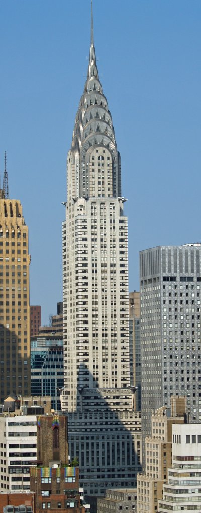
I like the work of Dave Hill, he is an American commercial photographer that specialises in digital composites. Dave takes multiple photos and then stitches them together brilliantly to create excellent images.

An example of work done by Dave Hill.
My skills in Photoshop are currently VERY much less than those of Dave, and probably will not ever exceed them. I am learning, I will strive to meet his ability or get as close as I can.
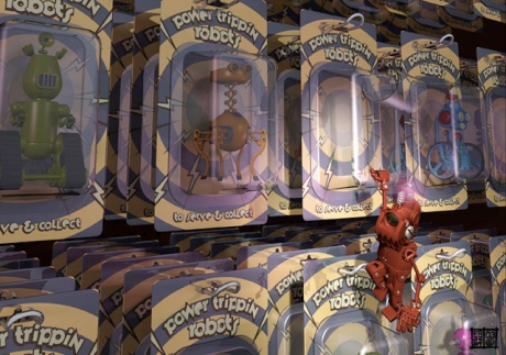
My favourite illustrator is James Gurney, he has illustratied books (including his own) and magazines. Whilst some of James’s work is clearly painted, other works at first sight I think can be easily mistaken for photos. I would love to draw like James, but I do not foresee it ever happening, I will leave illustration to the experts!

An example of work done by James Gurney.
Diagrams however I can do, I have worked on diagrams for a telecommunications supplier who needed them for bespoke equipment they were making. The company is happy with my work, but I still need to improve in this area. In diagrams there are certain conventions that should be adhered to, such as; all text should be horizontal and the same way up (In many of my first diagrams when labelling dimensions on lines, I rotated the text to be parallel with the line). I intend to research so I can continue to offer diagrams, but to a more ‘professional’ standard.
I think that typography is important. The headline or title should draw someone to read the body text, this is achieved by using an appropriate hierarchy. The headline or title is generally big so can accommodate an ‘artistic’ treatment to make it look good, as long as it does not cripple the legibility. When choosing a font for the body text I consider how well the font complements the subject, the font’s legibility and how and on what stock it will be printed. An easily readable font aids comprehension of the text. I generally prefer San Serif fonts, my favourite font is Futura (except it’s question mark which I don’t like).
The layout of my work varies greatly. The layout may or may not be based on a grid. When a grid is used, it’s design is influenced by the page dimensions and shape, and the main type of content (mostly text or mostly image). In some work a grid will help organise and structure the work, but in some work a grid can be too limiting and a more free and lose layout is best. As previously mentioned layout should have hierarchy, this means more emphasis is put on the most important elements e.g. an extra large title, large sub-titles, medium body text and small image captions.
All my current work is designed for print. I produce most of my work using Adobe InDesign. I am not an expert and I am sure there are still many features it can do that I am yet to discover, but I am confident using it and can produce almost any ideas I think of in it. I can also use Photoshop and Illustrator, but not as well as InDesign. I intend to improve my ability in Photoshop and Illustrator ‘as I go’. When I am working and what to achieve something I think I should be possible with the software I am using I will research and find out how it is done, then I will know for next time. I would like to explore web and digital work, I do not think printed media will die-out soon, but a lot of media is now digital, mostly distributed on the internet. Therefore I think it would be beneficial for me to learn how to use Adobe DreamWeaver. DreamWeaver is not taught on my course, as far as I know, so I am going to investigate doing a stand-alone course for DreamWeaver alongside university as I think it would be useful in the future.
Top ten designers
January 11, 2010
David Carson

Godtfred Kirk Christiansen

Jonathan Ive

James Dyson

Jean-Charles De Castelbajac

Milton Glaser

Eames

Terence Conran

Jasper Conran

George Davies

Top ten favourite websites
January 11, 2010
Top ten photographers
January 10, 2010
Dave Hill
www.davehillphoto.com

Jonathan Kitchen
www.jonathankitchen.com

Kelvin Murray
www.kelvinmurray.com

RANKIN
www.rankin.co.uk

Gregory Malphurs
www.gregorymalphurs.com

James Murphy
www.jamesmurphyphoto.com

Matt Stuart
www.mattstuart.com

Tim O’Sullivan
www.timosullivan.co.uk

Dana Neibert
www.dananeibert.com

Jillian Edelstein
www.jillianedelstein.co.uk

Top ten architects
January 10, 2010
Frank Lloyd Wright

Norman Foster

Ken Yeang

Isambard Kingdom Brunel

Manfred Adams

Espen Erikstad

Jhon Oberg Utzon

William Van Alen

Andrea Palladio

James Stewart Polshek

My top ten favourite fonts
January 9, 2010
Futura

Din

Calibri

Mason

Sanvito

Agency

Times New Roman

Colonna

Brushstroke Plain

Jokerman

Top ten illustrators
January 9, 2010
James Gurney

Lee Montgomery

Derek Bacon

Shoo Rayner

Helen Oxenbury

Alex Trochut

Andy Hammond

Quentin Blake

Chris Fisher

Jason Freeny

Ten art an design venues I would like to visit.
January 6, 2010
Bristol Arnolini
Tate modern
(Rushed around to much the first time I went, I want to spend some time there)
V&A
Free-Range (big graduate show)
National Gallery
The Design museum
(the first time I went I was not impressed, I think it was because I did not like the featured designer when I went, I would like to go again when there is someone I am interested in on show)
The Museum of Brands, Packaging and Advertising
London Design Festival
24th International Biennale of Graphic Design Brno 2010
saatchi gallery


